Appearance
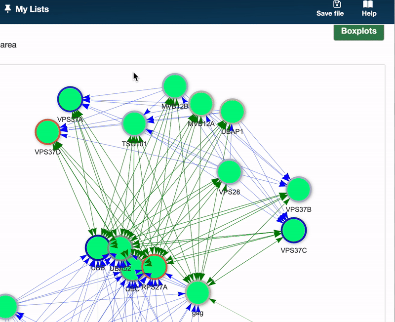
Introduction to Boxplots Pathway graph
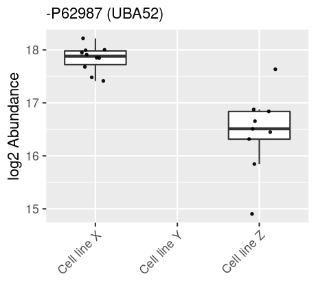
A Boxplot, or box-and-whisker plot, is a graphical representation that summarizes the key characteristics of a dataset through its quartiles, showcasing the distribution, central tendency, and variability of the data. This allow you to quickly assess, how different samples groups differs or are similar in the expression of the choosen id, hereby asssesing the distribution.
Using Boxplots
To generate boxplots, select your node(s) of interest within the Pathway graph and click the Boxplots button located in the upper right corner. A Boxplot will be generated for each selected node, allowing for detailed comparative analysis.
Here’s how to read a Boxplot:
- Central box: Represents the interquartile range (IQR), with the bottom and top edges indicating the first (Q1) and third (Q3) quartiles, respectively. The IQR contains the middle 50% of the data points.
- Median line: A line within the box marks the median (Q2), dividing the dataset into two halves. The median’s position provides insight into the data’s symmetry.
- Whiskers: Extend from the box to show the range of the data. Typically, they extend to the lowest and highest points within 1.5 times the IQR from the first and third quartiles. Points beyond this are considered outliers.
- Outliers: Points lying beyond the whiskers are plotted individually, highlighting data points that fall outside the typical range.