Appearance
A guide on Legends Pathway graph
This section provides a guide to the legends used in the Pathway graph. It covers essential elements including the meanings of the color indications for Nodes, Arrows, and how to use the Tooltip.
Nodes
In the visualization, nodes represent biomolecules such as genes, proteins, or metabolites. These entities are the fundamental components of pathways, and can be interacting through various processes. The annotation of nodes and their interactions facilitates a deeper understanding of the biological mechanisms at play. Nodes can be characterized by several attributes, including their regulation status and involvement in specific pathways, which are visually distinguished in Omics Studio's Pathway graph.
This is a node:


Outer circle
The outer circle of each node provides information about the regulation of that node, specifically its Log2 Fold Change (log2FC) which reflects the expression change of a gene or protein. The outer circle's color coding hereby indicates the regulation degree—expand below for more details.
Learn more about the Fold Change colors
◯ More significant downregulation. This color is used to indicate a more significant decrease in gene or protein expression corresponding to a log2FC < -2.0.
◯ Less significant downregulation. Light blue represent a less significant decrease in expression levels corresponding to a -2.0 < log2FC < -0.5.
◯ Neutral or no significant change. Gray is indicating no significant change in expression levels corresponding to a -0.5 < log2FC < 0.5.
◯ Less significant upregulation. Orange can symbolize a less significant increase in expression levels corresponding to a 0.5 < log2FC < 2.0.
◯ More significant upregulation. Red signifies a more significant increase in gene or protein expression corresponding to a log2FC > 2.0.
This illustration demonstrates the gradient of Fold Change, ranging from more significant downregulation through neutral to more significant upregulation:
Inner circle
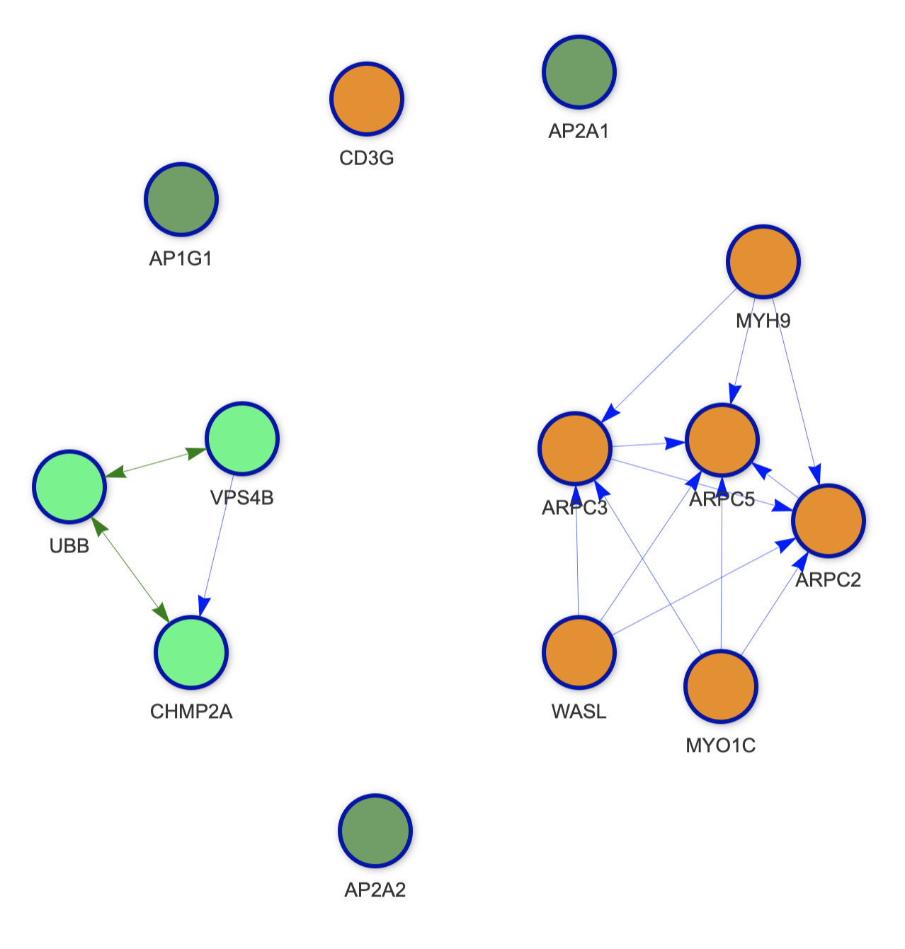
The inner circle's color varies by pathway. In cases with multiple pathways loaded, each color represents a different pathway (e.g., green vs. purple). An example below shows a graph with two pathways: ⬜ green, and ⬜ orange. The third color ⬜ dark green represents nodes shared by the two pathways.
💡 Good to know
⬜ Dark green is always used for shared nodes, even if nodes are share between more than two pathways.
See example
Arrow indicators
The arrows in the Pathway graph represent various functions:
→ Activition: Signifies that one biomolecule activates or enhances another's activity, potentially increasing gene expression, protein production, or enzymatic activity.
→ Binding: Indicates physical associations between two or more biomolecules, essential for processes like signal transduction and enzyme activity.
→ Inhibition: Represents inhibitory interactions where one biomolecule decreases another's activity, affecting gene expression, protein levels, or enzymatic activity.
→ Process: Used to denote a biomolecule's role in transition process.
Tooltip
The tooltip shows you all relevant data for the node in question. By hovering or clicking on a node, a tooltip opens and you can see data such as the pathway, Log2 Fold Change, p-value, and adj. p-value.
Example
Pathway: HIV Infection
Log2(FC): -2.18465918806971
p-value: 5.581861e-26
Adj. p-value: 2.680602e-24